Call it a passionate hobby. I don’t practice interior design by trade, but I’m most definitely an interiors addict who has spent many years studying the spaces that inspire me. Over time friends have come to lean on me for free decorating advice (which I love to give). As a result, I’ve noticed a few common interior design mistakes that people struggle with in terms of decorating, and some of them I had to learn myself the hard way.
Whether it’s over-styling a small space, jamming light-loving plants in a dark corner, or simply not having a clear vision and aesthetic, we’ve all fallen victim to one interior design mistake or another at some point. Likely, you have a general sense of what your design preferences are—but the ability to articulate and execute a vision doesn’t always come naturally for all. The trick is to assess what you’re working with and make tweaks here and there that elevate your space. Likely you don’t need to do much to fix a design faux pas and really enhance the look of your home.
Luckily, this doesn’t have to be an overwhelming or even very expensive endeavor. If you’ve fallen into a design rut or find yourself looking around your home and realizing you’ve made a few mistakes here and there, never fear. Help is here! It happens to the best of us.
Read below for my list of the most common interior design mistakes and tips on how to avoid them. But remember, there are no hard and fast rules when it comes to design—ultimately, your home is a reflection of you and the styles you love, so go with your gut and have fun!
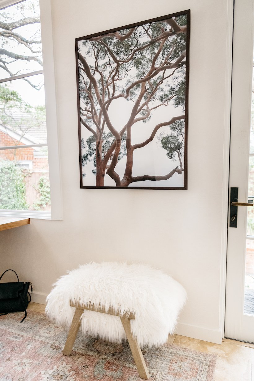
Sin #1: Hanging Art Too High
This is one of the most common mistakes that I see in people’s homes. For some reason, it’s tempting to hang art high on the wall—maybe because it can feel more “important” up there. But art should be hung at eye level for optimal viewing and balance in a room. When creating a gallery wall, the group should be weighted at eye level like in Sara Ruffin Costello’s living room.
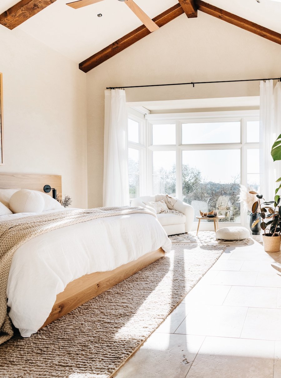
Sin #2: Full-Length Curtains That Are Too Short
Think of full-length curtains as you would pants—they should break at the ankle. Are your curtains flooding? Make sure your full-length drapes break and rest slightly on the floor, even if it’s just an inch. For a more elegant, formal look, they can even pool on the ground like in this room designed by Rose Uniacke.
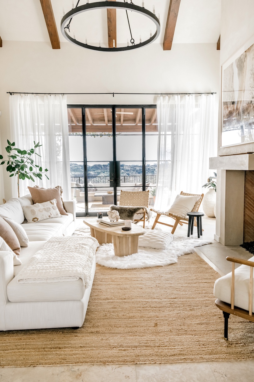
Sin #3: Not Enough Negative Space
When it comes to furniture, remember this: just because it will fit doesn’t mean you should buy it! Always consider protecting a nice amount of negative space in a room for a more balanced look. For apartments and smaller spaces, settees, and under-scaled sofas often look best—like in this room by Rebecca Fredriksson.
Sin #4: Bad Lighting
Even the most beautiful space looks a bit scary under fluorescent overheads. Always consider both natural and artificial light sources when designing a space. You won’t regret the money you invest in the bulbs and fixtures that give off the most flattering light. We love the combination of bare windows with a statement pendant fixture in this dining room by Alicia Lund.
Sin #5: Hanging Curtains Too Low
Don’t be afraid to hang curtains much higher than the tops of your windows to add elegance and drama to a room, like in Camille’s neutral living room.
 Sin #6: Awkwardly Sized Rugs
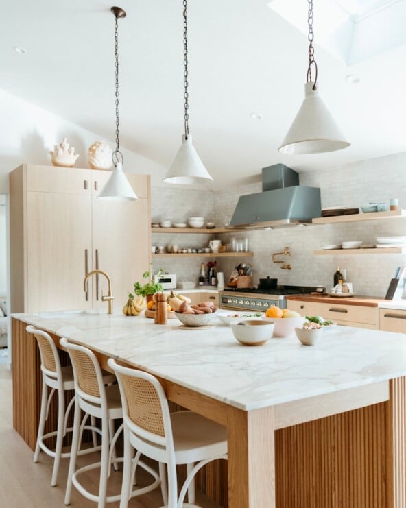
As a general rule, all four legs of a piece of furniture should be able to fit on the rug beneath it, with breathing room on all sides. That said, we’ve seen some clever ways to break this rule that really works. For instance, it’s an advanced move but (if you’re feeling daring) you could try layering several smaller rugs together to create a larger patchwork rug space for underneath a sofa and coffee table. But in the meantime, we always love seeing a perfectly sized rug underneath a table like in this kitchen designed by Elizabeth Cooper.
Sin #7: Decorating From the Details Up
When I took a sketching class in college, our professor taught us to “draw the whole thing first”. What he meant was taking time to establish scale before honing in on the details. I’ve found that the same is true for interiors—the best spaces have a strong foundation of balance between the architecture and the furniture. When decorating a room start by establishing a good, functional arrangement of furniture before considering details like color and theme. Designer Michelle Adams was able to successfully use a wild combination of pattern, color, and subject matter in this small bedroom because she first established a strong overall balance to the space with the furniture. So before you start building that incredible taxidermy vignette, think about the room as a whole.


